Prediction and Explanation in Social Sciences: Introducing a Set of Useful Methods
During my PhD studies, I noticed a growing number of methods available to answer research questions in the social sciences. Computational social science has combined complex social-systems problems with advanced statistical and computational techniques, letting researchers answer questions that would otherwise be out of reach. The volume of data generated by social media users is enormous; without big-data methods to extract and transform it, and the computational power to analyze large social networks, studying this kind of phenomenon would be very limited. In this context, scholars have pointed to the importance of understanding how these new tools can improve the quality of social science research — specifically, by clarifying when to use them to explain a problem versus predict it (Hofman et al., 2017). This is the first post in a series describing a set of methods I’ve studied and collected from different sources; the goal is to make the material available in one place. The selection here isn’t meant to be exhaustive. Instead, it’s meant as an introduction for social science researchers interested in analytic tools for inferring predictions or cause-and-effect relationships.
This post covers the basic difference between prediction and explanation. I’ll lean on a classification developed by Shmueli (2010) to walk through how the two ideas differ. In essence, it comes down to what question you’re actually asking: are you trying to predict an outcome, or explain why it happens? Building on Shmueli’s framework, and adding how social scientists have approached this more broadly, I’ll try to set up common ground for why the methods covered in later posts can serve one goal, the other, or both. Shmueli splits statistical modeling into two main types, explanatory modeling and predictive modeling, and adds a third, descriptive modeling, which turns out to describe a lot of social science research as it’s actually practiced.
Explanatory modeling means using statistics to test a causal theory, a claim that one thing causes another. Researchers start with what they already know about a topic, build a theory out of it, and then check whether the data supports that theory. Sounds straightforward, but defining “causality” itself turns out to be surprisingly hard. Philosophers have argued over what “cause” really means since Aristotle, who split causes into four types (material cause, formal cause, efficient cause, and final cause). More recently, the social scientist Henry Brady (2011) reviewed this debate and proposed four practical tests a real cause should pass: (1) the cause and effect consistently show up together, (2) the effect disappears when the cause is absent, (3) the effect appears when you deliberately introduce the cause, and (4) there’s a mechanism connecting the two, so it is not just a coincidence.
A simple example shows why all four tests matter. Suppose people who sleep less seem more irritable. Does poor sleep cause irritability? Or does something else, let’s say stress, cause both independently, so they just happen to show up together? To defend the first explanation, you’d need to show that irritability reliably follows short sleep (test 1), that it fades when sleep improves (test 2), that it appears when you experimentally cut someone’s sleep short (test 3), and that there’s a plausible pathway connecting the two, like impaired emotional regulation (test 4). Skip any of these, and you risk mistaking a coincidence for a cause.
Even without full agreement on what causality really means, for the kind of analysis covered in this series, a cause is whatever the theory built into the model claims it is. Shmueli calls this kind of theory-testing explanatory modeling: using statistical models to test causal explanations. One especially powerful tool for this job, which I’ll cover later in the series, is Judea Pearl’s Structural Causal Modeling.
To see how social scientists actually build these explanations, look at the diagram in Figure 1, developed by Chaffee (1991) to show explanation as a repeating, back-and-forth process in Communication research.
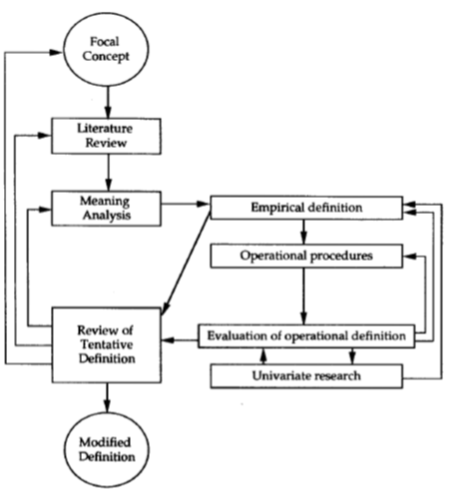
Figure 1
The idea behind the diagram is that researchers build their explanations around theoretical constructs, ideas like “trust” or “political polarization,” rather than something you can point to and measure directly. These constructs are the building blocks of an explanation. But because a construct like “trust” is an abstraction, researchers need a way to connect it to something real and measurable. That step is called operationalization. Trust, for example, can’t be observed directly, so a researcher might operationalize it as answers to a short survey, or as how often someone shares posts from a particular source. Once a construct is operationalized this way, you can measure it and use the resulting data to test your hypothesis. In short: explanatory modeling means applying statistical models to data in order to test causal hypotheses about theoretical constructs.
Predictive modeling is a different job entirely which means applying a statistical model or data-mining algorithm to data in order to predict new or future observations. Here the goal isn’t to explain why something happens, it’s to correctly guess an output based on a set of inputs. And unlike explanatory modeling, prediction doesn’t require a theory of why. A weather forecaster is a good illustration: they don’t need a complete theory of atmospheric physics to tell you it will probably rain tomorrow. They just need a model that’s proven reliable under similar conditions before. In social science, this idea is most easily illustrated with time series analysis, where researchers forecast a future value based only on values observed earlier in time.
For a long time, prediction got less respect in social science than explanation did, mostly because researchers put their energy into finding causes for social phenomena. That’s shifted, and scholars like Hofman, Sharma, and Watts (2017) argue that the computational tools now available to social science should let prediction play a bigger role. But they also flag three problems that need fixing first. First, the field needs agreed-upon ways to measure whether a prediction is actually good, what the authors call a “common task framework” which is essentially a shared benchmark problem and dataset that lets different research teams compare results on equal footing, the way computer-vision researchers all test their models against the same image dataset. Without something like that, researchers should at least be upfront about whether their analysis is exploratory (looking for patterns) or confirmatory (testing a specific claim). Second, we need a better sense of prediction’s actual limits, some things are genuinely unpredictable no matter how much data you throw at them, and it matters to know where that ceiling is, rather than assuming more data always means a better forecast. Third, there’s a common belief that simple, easy-to-interpret models and complex, highly accurate models are locked in a trade-off where you always sacrifice one for the other. That trade-off turns out to be smaller than most people assume: simple models don’t automatically generalize better than complicated ones, and “understanding” can mean either making sense of something (explanation) or successfully accounting for what actually happened (prediction).
Descriptive modeling is the third category, and its job is simply to summarize and represent data well, nothing more. It differs from explanatory modeling because it makes no causal claim, and it differs from predictive modeling because it isn’t trying to forecast anything. A typical example of description is a study reporting that posts using angry language get shared twice as often as calmer ones. That’s a descriptive claim, it doesn’t mean anger causes sharing, and it isn’t trying to predict which individual post will go viral. It’s just describing a pattern in the data.
This matters because a lot of published social science actually lives in a gray area. Even though there’s a well-developed toolkit for causal inference, a large share of papers present associations grounded in theory without ever claiming causation. That’s the whole point of the cliché “correlation is not causation”: path models, regression, and structural equation models (SEM) don’t necessarily let you compute a causal effect in the strict statistical sense, but they can still offer an explanatory, theory-grounded association. There’s no hard rule for telling whether a paper is explanatory or merely descriptive, but seeing a path diagram or SEM model is usually a signal that the authors are making a relational — sometimes causal — claim grounded in theory.
With that groundwork in place, the rest of this series introduces a set of methods meant as a starting point for researchers interested in tools for building explanations and predictions. These methods come from a few different fields: causal inference, time series analysis, and information theory. Table 1 summarizes the key features of each; I’ll walk through each one, one post at a time, later in the series.
| Method | Explain or predict | Variable type | # of variables | Stationarity |
|---|---|---|---|---|
| Structural Causal Modeling | Explain | Numerical/Categorical | Many | No |
| Instrumental Variable | Explain | Numerical | Many | No |
| Granger Causality | Explain/Predict | Numerical | Two | Yes |
| Transfer Entropy | Explain/Predict | Categorical | Two | Yes |
| Modes Information Flow | Explain | Categorical | Two | Yes |
| ε-Machines | Predict | Categorical | One | Yes |
| ARIMA models | Predict | Numerical | One | Yes |
Table 1: Methods Summary
A couple of terms in the table are worth unpacking. Columns 3 and 4 — variable type and number of variables — are fairly self-explanatory, but column 5, stationarity, needs a bit of explanation if you haven’t run into it before. Granger Causality and ARIMA models, in the table, are used for time series analysis; Transfer Entropy, Modes of Information Flow, and ε-Machines come from information theory. All five require data with a temporal structure showing a sequence of data points recorded over time, known as a time series.
Intuitively, stationarity just means a time series’ statistical properties don’t change over time, in the simple version used in practice, its average and its variability stay roughly constant. Picture the difference between a river’s water level, which rises and falls with the seasons but hovers around a stable long-term average, and a melting glacier’s runoff, which just keeps trending in one direction with no stable average to return to. The methods that require stationarity are built to work on “river” data. If your data instead behaves like the glacier, you’ll need to transform it first before these methods can be applied honestly. I’ll walk through exactly how and when that matters as each method comes up later in the series.
Now that the core ideas (prediction, explanation, and description) are on the table, along with how they’ve developed within social science, I’ll turn to the methods themselves in the posts that follow. My hope is that having a clear sense of what each tool can and can’t do will help you use it well, and in doing so, get more honest answers out of the research questions you’re asking.
References
Brady, H. E. (2011). Causation and Explanation in Social Science. Oxford University Press. https://doi.org/10.1093/oxfordhb/9780199604456.013.0049
Chaffee, S. H. (1991). Explication. Thousand Oaks, CA: Sage.
Hofman, J. M., Sharma, A., & Watts, D. J. (2017). Prediction and explanation in social systems. Science, 355(6324), 486–488. https://doi.org/10.1126/science.aal3856
Shmueli, G. (2010). To Explain or to Predict? Statistical Science, 25(3), 289–310. https://doi.org/10.1214/10-STS330